Designing Nova Pay: Reducing Friction in Fintech Onboarding
RECOMENDED
CASE STUDY
3 min reading

Balancing Simplicity and Trust
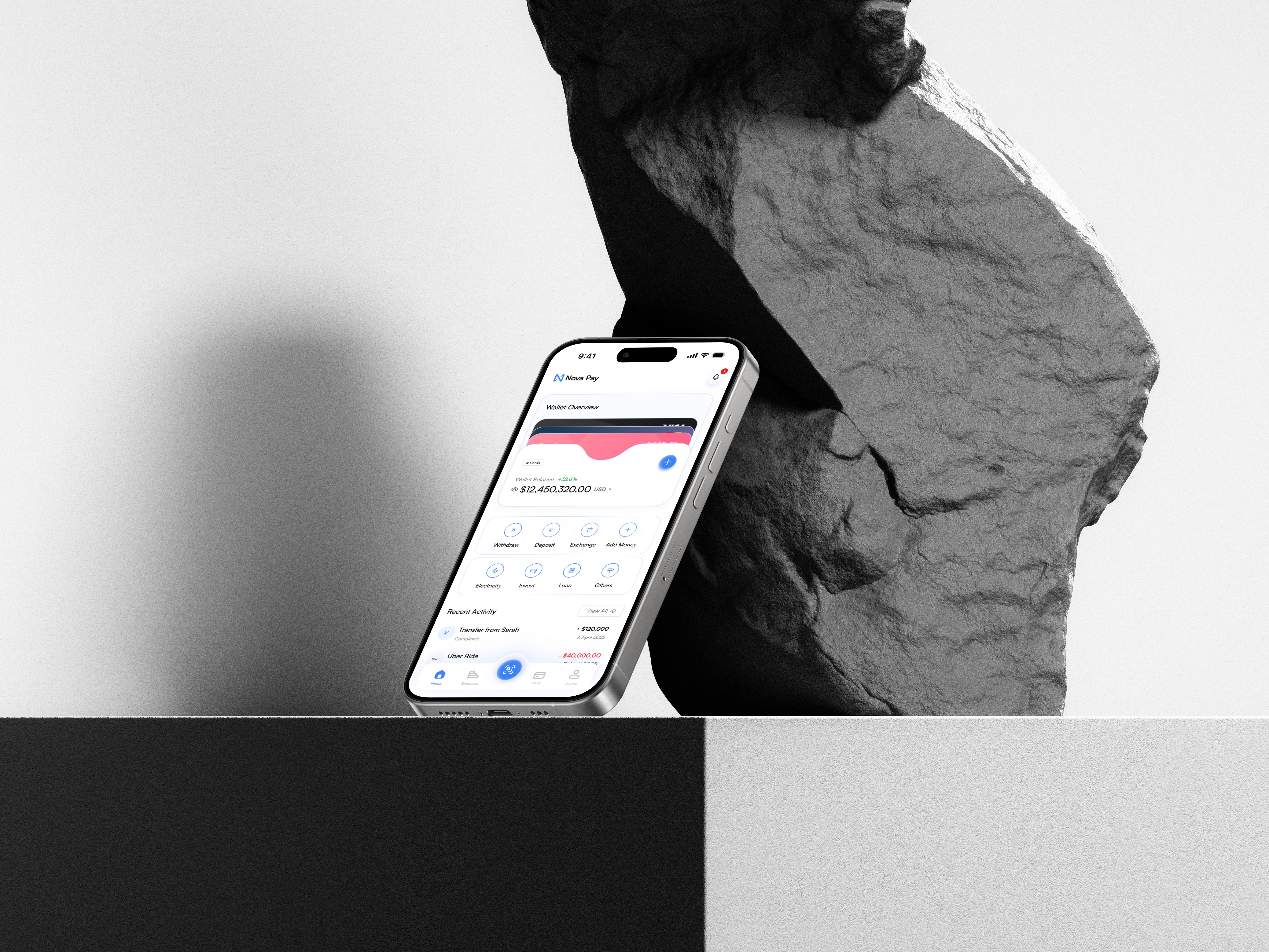
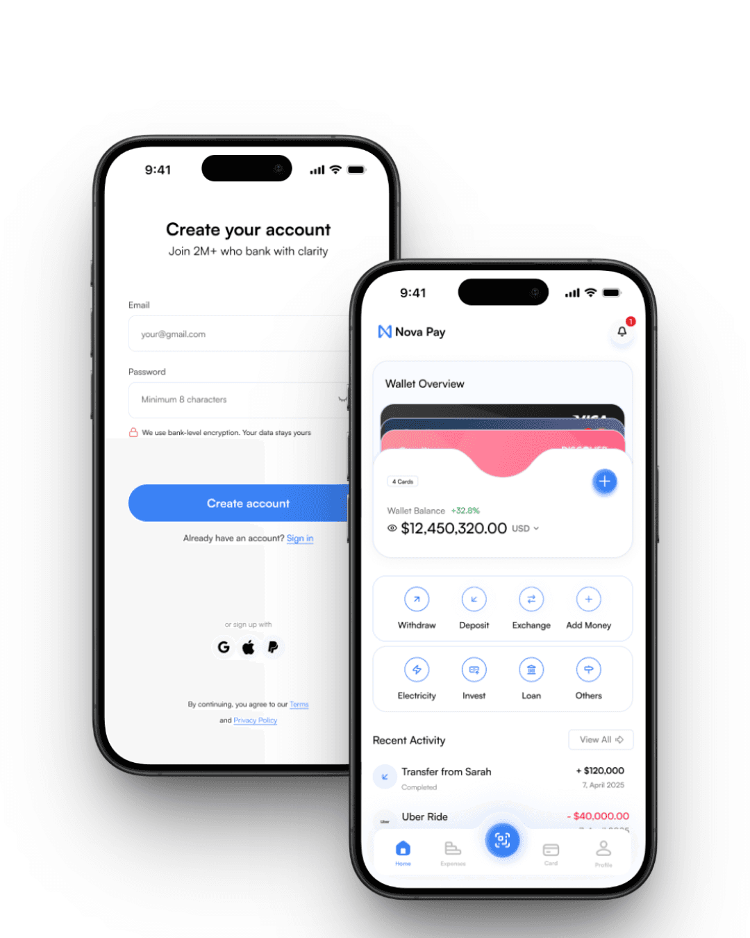
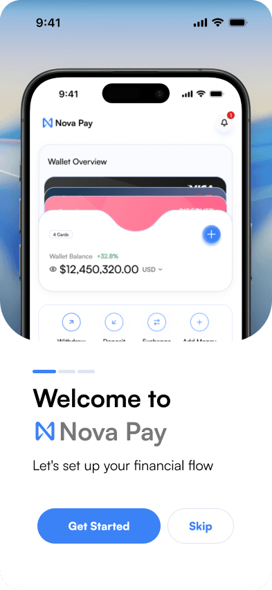
When tackling Nova Pay’s onboarding flow, I found myself obsessing over every detail. The biggest friction point for users wasn't the information they had to provide—it was how intimidating financial forms could feel. By decluttering the interface, focusing on essential fields, and using soft typography, I aimed to make the process approachable. I purposely left generous whitespace between form elements to reduce cognitive load, giving users visual resting points. These seemingly small choices can have quietly profound effects on first impressions.
Typography
Choosing a typeface for a fintech project is always delicate. I wanted users to feel the product was secure, but not heavy-handed. That led to a sans-serif font with slightly rounded edges, paired with clear, straightforward labels. Emphasizing readability helped build trust—not through bold claims, but through subtle signals users pick up subconsciously. Success messages use tonal color highlights, avoiding harsh greens or reds that might feel alarming, and instead using calming hues to reinforce a sense of progress.
Spacing and Micro-Interactions
Cards and input fields are spaced farther apart than typical SaaS dashboards. That spacing was a deliberate decision to help users breathe—especially important when onboarding asks for sensitive information. Micro-interactions, like gentle animation on success states, build a cumulative sense of reassurance. By refining these moments, I learned that onboarding isn't just about movement through a funnel—it's about designing for emotion and trust, pixel by pixel.


